Themed Color Charts
The Colors of Ancient Egypt
Painted color palettes from the Nile and Versailles…
I love antique color charts and I love making my own samplers as well.
A few posts ago I told you about my experience making my own watercolors. Since then I have made a few more and decided to create custom color palettes to go along with them.
And since I love history and I love a theme, I made them historical based on antique paintings, tomb wall photographs (from Egypt) and so on.

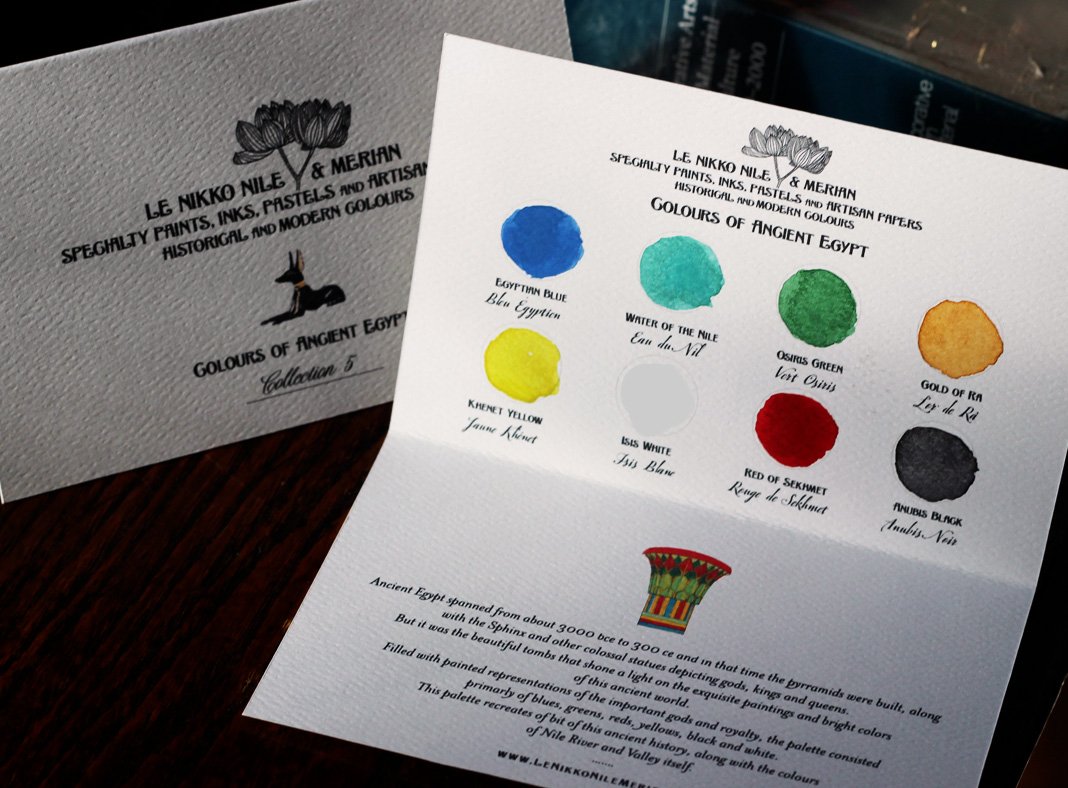
Front of the color palette folded card for the Ancient Egypt color collection.
Along the Nile Colour Palette
There is something so romantic about ancient Egypt.
It was and is fascinating with all kinds of rituals and magic and superstition - but that’s not really the romantic part - the romantic part is more about the idea of the vintage Egyptologist and adventure seeker, who is usually somewhat academically inclined to boot.
In other words, it’s the Indiana Jones type character or Rachel Weisz’s role as Evelyn O’Connell in The Mummy series with Brendan Fraser.
When Howard Carter discovered Tut’s tomb in the early 1920s, the world fell into a mad craze for all things ancient Egypt inspired, colors (yes, usually I spell it without the ‘u’ but in my palettes, I prefer the British spelling, it’s a bit more elegant), motifs and patterns. It became part of the Art Deco style.
So, this was one of the first colour collections I made and I was quite happy with it.
These cards are put together with the idea of Le Nikko Nile & Merian being a sort of boutique art supplies brand. Fictional right now, but who knows - I made watercolors last week and I made my own pastels recently too. I wouldn’t mind adding more limited papers and luxury art materials to my line.
I chose the name Le Nikko Nile & Merian because I liked the way it rolled of the tongue. Le Nikko sounds French and I’m a Francophile (and Anglophile), Nile is obviously far-flung and exotic and Merian because I admire the 17th century British botanical artist, Maria Sibylla Merian.

‘L’ is for Louis
Ah, Versailles….
Versailles is another very romanticized place and the original Louis Kings that inhabited it were almost as colorful as their mistresses and wives (Louis XIV perhaps even more so).
The colours in this palette are both pale and darker, which was the case of the fashions worn at Versailles during the Louis reigns.

Versailles colour palette
Madame de Pompadour was so enamored with pink, it was named after her. From pale shades to dusty and deep. It wasn’t just the women who wore beautiful silks in the royal courts, the men were decked out too. It was part of their job to dress in luxury, whether they could afford it or not.

So those are my collections for now, I have a few more but am not quite finished with them yet. Perhaps I’ll do an update in a week or so.